A destination for storytelling
around wellbeing

My Role
-
Understanding the reading habits of users on the web and creation habits of authors via secondary and primary research
-
Defining fundamental principles of the product experience
-
End to end product design of visual composer and reading platform
-
Developing style guides and pattern library
-
Work continuously with the users to improve the experience with every release
-
Set a roadmap for the product experience and design
Overview
The magazine is one stop content consuming platform for Wellbeing dealing into two diverse Channels:
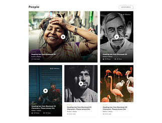
1.) Samsara - Content about the bio-diversity of India, conservation and human connection with it.
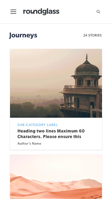
2.) Journeys - Stories about travel experiences that are never heard of. The story telling aims to take the person from their seat to the wonderland without moving an inch.
How is it Wellbeing?
Here at Roundglass, we define wellbeing not only the physical health but also the emotional, mental and meta-physical health of a person.
The Challenge
Contribute towards company’s mission to be the most unique provider in well being space by creating a content consuming platform
Target
For the MVP, we targeted users coming from followers of our brand ambassadors and converting them into an audience for the platform

First Steps
We developed and designed a backend CMS on top of WordPress , where it takes the least time for Content Creators to present stories visually, without having to worry about which platform their readers are on, making sure that our in-house images and storytelling enforces the same experience on all devices. We developed a what you see is what you get: visual composer such that authors and editors focus more on their words, pictures and process.
The reading experience is super visual and clean, where Content Readers keep on discovering relevant and unique content. We focused on quality over quantity and slowly rolled out the ability to contribute.
Creating the "Lego"

The platform relies on pre constructed templates for the structural power and it designed to be image heavy. The goal was to help authors create diverse-yet consistent-look and feel using the same components and assets. The MVP started with two distinct Channels- Samsara and Journeys, which are wellbeing content about Environment and Travel.
Challenges:
One major challenge we faced while to were working on the component creating was the process followed by authors to create content. Since, all these stories are experiences of authors from the field, we noticed that authors worked on Microsoft Word right from the day of research to the day of finalising the approved content within the team. We respected this process and thus on the go CMS editor (like medium) was a difficult decision to take.

Horizontal Slice
Based on an internal design exercise where we wanted to understand how we wanted to construct our elements- we came up with a conscious decision of building in horizontal slices.
Horizontal Slices are basically division of a page into pre-defined rows; the rows are presented in a variety of choices to the editors in order to build their customizable Channels or Story Pages.
Using a limited set of reusable rows proved beneficial and it was easy to maintain and scale the design patterns across site. This in turn, gave us the opportunity to make designs responsive in a predictable and singular manner
In our system we established that row types would be used to build Modules or Micro Layouts. These allow our editors to curate custom clusters of content to create any kind of page.
For creating a framework that allows content creators to easily create and modify any page- ranging from different formats of articles, photo-stories, videos etc. in a consistent way, we designed:
1.) Modules for Channel pages
2.) Micro-layouts for Story Pages to
Modules


Micro-Layouts
Micro Layouts work for a bucket of words in a paragraph
Micro-layouts would helped us to gather information about the style of writing each author has and see what what type of content the users are mostly reading. The aim for have micro-layouts is to reduce time to create visually attractive layout.


Building Block-
Visual Composer ( Prototype)
The prototype is interactive
The Whole- Reading Experience


The reading platform can be scanned in three major ways:
1.) Channels
a.) Samsara- Wellbeing content from the Nature
b.) Journeys- Wellbeing content about Travel
2. ) Curated Collections: These collections are specially crafted for a particular theme/topic
3.) Dynamic Collections: Collections that are auto generated based on tags or group of tags.
Each of these channels can be built in a skeleton using the Modules. These Channels are either curated or collected using tags that are defined at the story level.


Our aim was to make the user keep on finding exclusive and curated content.
The current session time on the magazine is approx 9 minutes

Magazine 1.5
After we released version 1, we improved on the discoverability of Content,
improved visual experience and search capabilities. We introduced Reader Submission, Likes and comments on article pages.
Discoverability of Content
There was a clear gap in version 1 regarding navigation, discovering old/targeted content, thus we introduced search and improved Navigation. The search pattern has to parts:
1.) Suggestive Search
2.) Tag Search
The logic for Search Results for keywords
a.) Heading
b.) Tags added in the tag section
c.) Number of times the keyword appears in the article
d.) Author Name
e.) Most liked
f.) Most viewed
g.) Most recent
Related Tags were designed based on the search input keyword and the common tags of the top result.
Example the top result has Tag1, Tag2 , Tag3, Tag4, Tag5 , Tag6
where Tag 2 is repeated in the first twenty search result article the most, lets say 15 times, Tag5 is repeated 12 times, Tag6 is repeated 11 times, Tag 2 is repeated 6 times, Tag 4 is repeated 3 times and Tag 1 and Tag 3 are not repeated. Then the order of related tags would be Tag5, Tag6, Tag 2, Tag 4, Tag1,Tag3


Improvements
In version 2.0, which is still in production a dedicated visual designer has improved the visual and UI of magazine with introduction of more header styles and article patterns. This improved the user readability, typography and engagement


